
Tuesday, 6 December 2011
Wednesday, 2 November 2011


Tuesday, 1 November 2011

Tuesday, 18 October 2011
chart analysis


My second question tells me how often people buy magazines and 57.1% of people buy magazines whenever they want.

My third questions tells me that 66.7% would like magazines to be publishes weekly and also 66.7% of people would like it to be published monthly as well.

My fourth question tells me how much money people pay to buy a magazine, 71.4% pays between £1-£2 on magazines, 57.1% spends £3-£4 on magazines and 14.3 spends between £5-£6 on magazines this tells me that majority of people prefer to spend less on magazines.

This questions lets me know what type of magazines people prefer to read, iv listed 5 popular magazines people reads and 60.0% prefer to read the OK magazine, which is filled with information about celebrity’s and gossip so that when I’m designing my magazine I should include well known celebs and gossip readers would be interested in.

This question lets me know what type of people I should have on my front cover of my magazine. 66.7% would like to see a celebrity on my front cover and 33.3% would like to see a model on the front cover.


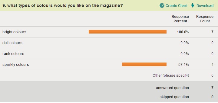
This question tells me what colour I should include in my magazine that people will like and would attract people’s attention, 100.0% would prefer bright colours whereas 57.1 prefer sparkly colours so I should include both of them in my magazine.
Wednesday, 12 October 2011
Tuesday, 11 October 2011
Analysing the two page spread
The type of languages used in Tulisa’s interview is informal because she’s answering the questions she’s been asked in the interview comfortably she’s not hesitant or rude because the magazine is aimed at teenagers, for example “how do you feel about the chav label” supposedly someone from a council estate with a cockney accent, that doesn’t make you a bad person, she relates to us to because she’s been through it before so she’s relates to the audience reading her article in a capable way. The colours being used in Tulisa’s article are light baby blues and white with black text writing, the colours are soft and warm, the colours tells us that Tulisa is not a diva she’s more gentle and calm because the questions about her life family problems and her place as an X Factor judge so the colours blends it great. The style of the text is bold for the questions being asked and the answers are small and regular thin writing, which blends in with the back ground colour. The double page spread is layered out on two pages with the interviewed on two pages and Tulisa has her own photo on one page with quotes of her answers to attract the reader’s attention and engage them to her story. The tone being used in the article is calm and appropriate because there having a conversation with each other without Tulisa being uncomfortable with the questions. Tulisa being represented as a fashion role model in this magazine, also the article is different to the front cover of the magazine, the front cover is more bright and glamorous because it includes the colour pink, and the writing is more in your face and eye popping, the article is more gentle and warm because of the colour baby blue and the text and writing style is more plain than fancy.
Wednesday, 28 September 2011
Analysing a magazine cover

The magazine I am analysing is called Company which is a fashion magazine that will contain articles about fashion, what’s the latest trend on the high street, make up, perfume brands, celebrity hair styles and autumn/ winter wear.
The target audience for this magazine the company magazine mostly targeted for fashion lovers and stylish women between the ages of 18 and over. It is very popular among young people and that mostly deal with topics like fashion, hair style, gossips, beauty, health and lifestyle and so on.
The direct mode of address in the Company magazine is looking directly at us, using the direct mode of address will attract people’s eyes and have a personal bond with them. The way the model is posing is glamorous and feisty, which goes, with what the magazine is about, fashion. This tell us that the model wants an audience who will look up to her as an inspiration as a fashionista and a role model.
The model on the front cover of the Company magazine is Tulisa Contostavalos because she is a fashion idol and is also joined the judging panel on the X Factor which is the biggest show on TV and is the model that is being interview about her ups and downs in her past and what she is going to bring in the future on the X Factor.
The Anchorage text says “TULISA, I am going to shake up the X Factor”. This implies that she is fierce and a dominant person and is going to take her role as a judge serious and wisely. The overall message Tulisa is giving out is that, she determined and is going to bring something new to the show.
There are a few “buzz” words but the main one that grabbed my attention would be the words “Celeb Fashion Takeover” it will grab people’s attention because its bold, pink and in your face and the words grabbed your attention because if contains the word celebrity who peoples are obsessed with and looked up to them as a role model. And another buzz word that attracts my attention was “wow” because it makes me want to know more about the magazine.
The structure and design of the title is bold and big to let the audience know the name of the magazine, it is also pink which implies that it’s a girls magazine and would contain information us girls would find helpful and inspiring and also its tell you that it’s a fashion magazine because the model is wearing fashionable clothing and her poses tell a story and using direct mode of address would attract a bond with the reader.
The puffs phrases like “Get the high street” and Put your new-season face on” suggest that the magazine is going to contain information about the latest trends and clothing line in the clothing shops and the different types of cloths suitable for the season in this case it’s a winter season.
The slogan “The new autumn/ winter trends on The Wanted, Kara Tointon, Myleene, Olly Murs, Nick Grimshaw and Ashley Banjo” This Slogan helps attracts readers because those are the names of celebrities who’s quiet well known and everybody’s talking about at the moment so the names would grab the readers attention and the readers would want to read about them.
The colours being used are mainly pink, white, yellow and black. I do find them attractive because the Company is a girl’s magazine and those colours are more associated with girls and the hot pink stands out the most. The writings are in different types of fonts to decorate the magazine, the title is massive bold and the sub heading is in a different writing style and still bold and thick so it cans stand out.
The magazine used different strategies such as the colours of the magazine which are bright and bold that will attract its target audience which are girls, they use a model who’s in the media allot and who is a massive inspiration to girls, they use celebrity names on the front cover that would be inside to attract audience to want to read more about them, they also using buzzing words such as “WOW” and “GET SET HIGHT ST” that grabs the audience attention and want to know what’s so great about the magazine.
Thursday, 7 July 2011
Evaluative Analysis
In my poster the conventions I used eye catching image, I had the title of the film, a tagline, the names of the actors and director, and the production blurb. The eyes catching image with grab their attention and would want to know more about the film. The tagline will give out a hint of what genre the film is, the name of the actors will let them know who’s in the film and they might have a favourite actor and would get them more interested in seeing the film also the same for the director and it will also the audience engaged. The title the way its constructed, font or style also suggest the genre of the film and it’s also meant to be the name of the film and its meant to be memorable, which will keep make the audience want to see the film to know what’s it about.
In my poster the most eye catching object is the picture and the title I presented it to be eye catching and bold so it can grab the audience attention and get them engaged. The text and image mixed together creates a more sophisticated image because the tile hints out the genre of the film and the image give us a clue what the films about.
In my trailer storyboard the conventions I used was the title of the film, the name of the main stars so the audience will know who will star in the film. I also included the names of the director, on screen text and information about the film including stars names the director, tagline title and release date, music in the trailer so it can suggest the genre, style and the plot of the film.
I have represented my main character to be a hero and to dress casual to blend in with the other people and the rest of the characters that are in the military to be dressed in army costume and be represented as a hero as well and also fighter of the country. I have chosen paramount pictures to distribute my film because it’s a popular film company and will give the audience another reason to see watch the film.
Tuesday, 21 June 2011


Trailer analysis questions
A movie trailer is an advertisement that tells us about an upcoming film that will be shown at the cinemas. A trailer includes key parts from the film but in different order and doesn’t give away any important plot details. The names of the main stars are put on screen early in the trailer, so it lets the audience know who’s going to be starring in the film. Audience will often decide they want to see a film just because of the stars in it. A trailer also includes the name of the director/ producers of the film with phrases such as “from the directors of/makers of...” This helps the audience to make connection between the film being trailed and previously and recognised films.
Many mainstream films will use a powerful voice-over that draws out attention to the key points of the film. On screen text gives important information about the film, including the stars, directors/producers, tagline, and title and release date. Music is essential in trailers as it can suggest the genre, style and plot of the film.
The target audience for this film is teenagers and adults who are interested into fantasy, drama and thriller. The unique selling point of The Lovely Bones is the interpretation of the afterlife the dreamscapes are imaginative and visually amazing but are ultimately distracting from the main focus of the narrative that would attract the audience’s attention. The trailer gives away a few hints about the movie like when it showed the scene where the police are investigating the dead body and where the girl is in a fantasy looking scene which is meant to be heaven. The main characters are visible they are there in the entire trailer and there is not information on who direct the film only the film company and the narrators voice is overused by the characters in the film trailer. The genre of the film has been represented through characters by having an innocent character and murder, an investigator that tells me that the genres a thriller, also the lighting in the movies quiet dull and the places where she goes are very desolate and the music is not the type you would play when you happy it’s more of a mysterious, spooky music. The camera angles in the film are mainly close up, long shot, bird’s eye view, high angle and side shot, the shots goes with how the film has been presented.
I get a better description from the trailer than the poster because the trailer gives out more about the genre by having a narrator describe the a bit about the plot and hearing the music to tell me what type of genre it is and seeing the lighting and camera shots and the different shades of colour being used and the poster just tells us who produces it and what actors are going to be in the film and the picture is still you can’t really tell what it’s about unless it has a synopsis with it. With the trailer you get more information about the plot and less confuse about what’s going on in the film, this makes the film more desirable to the audience because the audience has a better upstanding of what the films about.
The advantage of using an internet trailer to promote a film over using a poster campaign is that it gains the audiences because it’s being shown on televisions and been played on radios and the majority of teenagers and people watch television and listen to the radio. It also gives us a good amount of information but not too much to for us to know what exactly the films about. A trailer has sound so we can know what type of music is being played to grab out attention also taglines and the expressions of the characters.
Assingment bank 2

The typical codes and convections of the movie poster are,
A film director- is a person who directs the actors and crew in the making of a film. They control a film's artistic and dramatic aspects, while guiding the technical crew and actors.Title of Film-Allot of effort goes into the title e.g. (Style, font, colour, size and placement) it is meant to be unforgettable and also give us a hint about the genre of the film.
Tagline- it’s like a catchy slogan of the advertisement –offering another clue or the genre of the film.
The image- Related to the character and the stars in the films or the setting of the film.
Production Blurb- Information in tiny print that list the production and distribution companies as well as other information.
Film distributer- is a company or individual responsible for releasing film to the public either theatrically or for home viewing or through theatrical exhibitors and other sub-distributors.Certificate of the film- produced film reviews with guidance and advice.
The genre of the film is, Drama, Fantasy and thriller. I figured out it’s a thriller because her facial expression aren’t happy there shock, her eyes filled with terror and it looks like she’s scared. It’s a drama because the man identity is not being showed he’s hidden and the way the colour are light and as it get closer to the hidden man it goes dark/misty. It looks like a fantasy because there’s a male and female both genders are being presented.
The girl in the poster looked shocked and terrified and the man in the shadow seems mysterious and makes the audience want to know who he is and what’s going on. Also the setting has been placed in a forest and the way the changed the shades of colour as it moves near to the shadow man makes the film look like a thriller.
The word ‘Lovely’ In the title The lovely bones is designed big and bold so it stands out from the rest or the word because it gives us a clue that the girl has been murdered and that’s the only thing left of her, and the word ‘bones’ I would usually think of death, something frightening. The titles been design this way because it’s simple and unique and goes with the theme and picture its not to drastic.
Anyone who’s into thriller, fantasy or drama would go and watch this film. Also the director Peter Jackson is well known for directing the films ‘Lord Of The Rings and ‘King Kong’ and people who’s a fan of him would go and see this film as well. Also the theme sounds interesting and would attract your attention easily and would make you want to watch the film.
This film does not contain any interextuality or is reference to books television programmes of music tracks; it’s a new and is not based on other films.
DreamWorks produced this film it’s also a major Hollywood company but mainly produce animated films. The film company posted the poster on cinemas screens, magazines, the advertised it on television and on bill boards.
Thursday, 19 May 2011

The typical codes and convections of the movie poster are,
A film director- is a person who directs the actors and crew in the making of a film. They control a film's artistic and dramatic aspects, while guiding the technical crew and actors.Title of Film-Allot of effort goes into the title e.g. (Style, font, colour, size and placement) it is meant to be unforgettable and also give us a hint about the genre of the film.
Tagline- it’s like a catchy slogan of the advertisement –offering another clue or the genre of the film.
The image- Related to the character and the stars in the films or the setting of the film.
Production Blurb- Information in tiny print that list the production and distribution companies as well as other information.
Film distributer- is a company or individual responsible for releasing film to the public either theatrically or for home viewing or through theatrical exhibitors and other sub-distributors.Certificate of the film- produced film reviews with guidance and advice.
The genre of the film is, Drama, Fantasy and thriller. I figured out it’s a thriller because her facial expression aren’t happy there shock, her eyes filled with terror and it looks like she’s scared. It’s a drama because the man identity is not being showed he’s hidden and the way the colour are light and as it get closer to the hidden man it goes dark/misty. It looks like a fantasy because there’s a male and female both genders are being presented.
The girl in the poster looked shocked and terrified and the man in the shadow seems mysterious and makes the audience want to know who he is and what’s going on. Also the setting has been placed in a forest and the way the changed the shades of colour as it moves near to the shadow man makes the film look like a thriller.
The word ‘Lovely’ In the title The lovely bones is designed big and bold so it stands out from the rest or the word because it gives us a clue that the girl has been murdered and that’s the only thing left of her, and the word ‘bones’ I would usually think of death, something frightening. The titles been design this way because it’s simple and unique and goes with the theme and picture its not to drastic.
Anyone who’s into thriller, fantasy or drama would go and watch this film. Also the director Peter Jackson is well known for directing the films ‘Lord Of The Rings and ‘King Kong’ and people who’s a fan of him would go and see this film as well. Also the theme sounds interesting and would attract your attention easily and would make you want to watch the film.
This film does not contain any interextuality or is reference to books television programmes of music tracks; it’s a new and is not based on other films.
DreamWorks produced this film it’s also a major Hollywood company but mainly produce animated films. The film company posted the poster on cinemas screens, magazines, the advertised it on television and on bill boards.
Thursday, 31 March 2011

Thursday, 24 March 2011
 The First survey tells me that people buys designers brands accept for jack Wills.
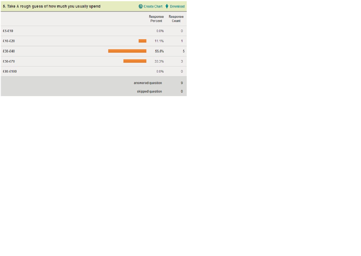
The Second Survey tells me that 37.5% prefers to wera trainers and boots and 25% prefers to wears pumps and heels and sandles no one prefers to wear them.


The third survey tells me that people mainly buy jeans, tops, trainers and accescories when they go shopping and bags and hats are the least to be brought.

The forth survey tells me that people mainly shop at selfridges, topshop, new look river island, and jane norman and JD, Footlocker, Primark and H&M is the last shops to shop at.

The Fifth slide tells me that 55.6% of people spend £30-£40 when they shop and 33.3% spend £50-£70 when they shop and 11.1% spend £10-£20 when they shop.
Thursday, 27 January 2011
Tuesday, 25 January 2011
Planning Your Own Print Advert

2)This product is associated with sports, it’s an expensive product, celebrity’s wears it and the tick backs it up by saying its good.
3)My product is aimed mostly at teenager but anyone can buy it, it’s a quiet expensive product so people who have money would mostly be buying it. Trendies would be the lifestyle categories.
4)Other than teenagers buying my product its can also be brought by people who have money and people who like brands like Nike and so on and if my products attracts their eyes.
5)Referring to the Maslow Hierarchy of needs my product links to the Self-Actualization column.
6)The persuasive Techniques I would use in my advert would be different type’s celebrity wearing my product, which would attract loads of customers.
7)The colours that would be dominant in my advert are white and black to represent both sexes.
Thursday, 20 January 2011


Tuesday, 11 January 2011
Advert comparison
Mariah Carey Forever

Mariah Carey facial expressions are relaxed and calm. She is staring directly at the camera so she is using a direct mode of address.
Mariah has been chosen because the perfume is made by her, her tag line is an ethereal presence captivating like a song, because she is a singer the tag line relates to what she does which is sing. There is kind of a female stereotype being used, because is naked and laying in water which is not really necessary for a perfume it will attract men’s eyes more instead of woman but it fit in because she wants to create a calm relaxed atmosphere and the back ground scene was chosen because it reminds of her favourite places she loves.
We associate with this product because Mariah Carey is beautiful and is a big inspiration to allot of people worldwide so the perfume and message in this picture is like a thanks you message for supporting her and people who is a big fan of her would like to buy her perfume.
Mariah in this photo is lying down on her chest in the water, she has her hand on her head and her face levelled with her shoulder pose, she is posing that way to link to the atmosphere of the background.
The background is orange and navy clouds with a purple sky which reflects into the water to give the water a purple/range colour. The colours are not too much or too bright or to dark there just about perfect. The bright orange in the photo stands out because it’s meant to be the sun set. Usually in a perfume add the model is usually standing up straight but in this perfume add she is laying down landscape which is more different and unique.
The target audience is from young teenager onward.
Beyonce Heat


Beyonce expression on her face is quiet sexually and fierce, she is also staring directly into the camera so it makes it direct mode of address.
Beyonce has been chosen because she is famous and it’s her own product.
The stereotype in her perfume add it beauty bunny and fashionista because she all glamorous up. Beyonce is another big inspiration to allot of people worldwide and all her fans that love her would want to know what type of perfume she would wear so it’s like a gift from her to the people who loves her.
Beyonce is posing with her hand on her cheek and her hip more out and in the centre on the photo. Her photo a bit to sexual because she is wearing a dress that expose the middle of her boobs and is inappropriate for young ages children but on the other hand her pose does link with the name to her perfume “HEAT” and the atmospheres of the background and colour layout.
The settings is a blackish reddish mixed together colour background and with Beyonce wearing the silky red dress which fits in with the colours scheme and the perfume bottle which is red as well so it all fits together and its not to bright or dark or blurry, it like a dim darkness which matches the atmosphere.
The target audience for bounce heat would be older teenager and onward.
Comparison Questions
Comparison Questions
The main differences between the Beyonce and Mariah Carey perfume add is that the Mariah Carey is more aimed at teenager and the Beyonce perfume is more sexually provocative and aimed at older woman.
There not really a main difference in these two perfumes adds because there both glamorous girl and both are beauty bunny and there perfume are both sexual provocative but there the way they pose tells me what target audience its aimed at and Mariah Carey’s photo is more clean and hidden than Beyonce HEAT photo.
In their ads they have used different persuasive techniques by using the Sub Title there different phrases and different meanings.
Subscribe to:
Comments (Atom)