
Wednesday, 2 November 2011

Tuesday, 1 November 2011

Tuesday, 18 October 2011
chart analysis


My second question tells me how often people buy magazines and 57.1% of people buy magazines whenever they want.

My third questions tells me that 66.7% would like magazines to be publishes weekly and also 66.7% of people would like it to be published monthly as well.

My fourth question tells me how much money people pay to buy a magazine, 71.4% pays between £1-£2 on magazines, 57.1% spends £3-£4 on magazines and 14.3 spends between £5-£6 on magazines this tells me that majority of people prefer to spend less on magazines.

This questions lets me know what type of magazines people prefer to read, iv listed 5 popular magazines people reads and 60.0% prefer to read the OK magazine, which is filled with information about celebrity’s and gossip so that when I’m designing my magazine I should include well known celebs and gossip readers would be interested in.

This question lets me know what type of people I should have on my front cover of my magazine. 66.7% would like to see a celebrity on my front cover and 33.3% would like to see a model on the front cover.


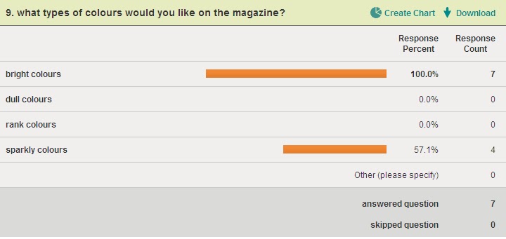
This question tells me what colour I should include in my magazine that people will like and would attract people’s attention, 100.0% would prefer bright colours whereas 57.1 prefer sparkly colours so I should include both of them in my magazine.
Wednesday, 12 October 2011
Tuesday, 11 October 2011
Analysing the two page spread
The type of languages used in Tulisa’s interview is informal because she’s answering the questions she’s been asked in the interview comfortably she’s not hesitant or rude because the magazine is aimed at teenagers, for example “how do you feel about the chav label” supposedly someone from a council estate with a cockney accent, that doesn’t make you a bad person, she relates to us to because she’s been through it before so she’s relates to the audience reading her article in a capable way. The colours being used in Tulisa’s article are light baby blues and white with black text writing, the colours are soft and warm, the colours tells us that Tulisa is not a diva she’s more gentle and calm because the questions about her life family problems and her place as an X Factor judge so the colours blends it great. The style of the text is bold for the questions being asked and the answers are small and regular thin writing, which blends in with the back ground colour. The double page spread is layered out on two pages with the interviewed on two pages and Tulisa has her own photo on one page with quotes of her answers to attract the reader’s attention and engage them to her story. The tone being used in the article is calm and appropriate because there having a conversation with each other without Tulisa being uncomfortable with the questions. Tulisa being represented as a fashion role model in this magazine, also the article is different to the front cover of the magazine, the front cover is more bright and glamorous because it includes the colour pink, and the writing is more in your face and eye popping, the article is more gentle and warm because of the colour baby blue and the text and writing style is more plain than fancy.
Wednesday, 28 September 2011
Analysing a magazine cover

The magazine I am analysing is called Company which is a fashion magazine that will contain articles about fashion, what’s the latest trend on the high street, make up, perfume brands, celebrity hair styles and autumn/ winter wear.
The target audience for this magazine the company magazine mostly targeted for fashion lovers and stylish women between the ages of 18 and over. It is very popular among young people and that mostly deal with topics like fashion, hair style, gossips, beauty, health and lifestyle and so on.
The direct mode of address in the Company magazine is looking directly at us, using the direct mode of address will attract people’s eyes and have a personal bond with them. The way the model is posing is glamorous and feisty, which goes, with what the magazine is about, fashion. This tell us that the model wants an audience who will look up to her as an inspiration as a fashionista and a role model.
The model on the front cover of the Company magazine is Tulisa Contostavalos because she is a fashion idol and is also joined the judging panel on the X Factor which is the biggest show on TV and is the model that is being interview about her ups and downs in her past and what she is going to bring in the future on the X Factor.
The Anchorage text says “TULISA, I am going to shake up the X Factor”. This implies that she is fierce and a dominant person and is going to take her role as a judge serious and wisely. The overall message Tulisa is giving out is that, she determined and is going to bring something new to the show.
There are a few “buzz” words but the main one that grabbed my attention would be the words “Celeb Fashion Takeover” it will grab people’s attention because its bold, pink and in your face and the words grabbed your attention because if contains the word celebrity who peoples are obsessed with and looked up to them as a role model. And another buzz word that attracts my attention was “wow” because it makes me want to know more about the magazine.
The structure and design of the title is bold and big to let the audience know the name of the magazine, it is also pink which implies that it’s a girls magazine and would contain information us girls would find helpful and inspiring and also its tell you that it’s a fashion magazine because the model is wearing fashionable clothing and her poses tell a story and using direct mode of address would attract a bond with the reader.
The puffs phrases like “Get the high street” and Put your new-season face on” suggest that the magazine is going to contain information about the latest trends and clothing line in the clothing shops and the different types of cloths suitable for the season in this case it’s a winter season.
The slogan “The new autumn/ winter trends on The Wanted, Kara Tointon, Myleene, Olly Murs, Nick Grimshaw and Ashley Banjo” This Slogan helps attracts readers because those are the names of celebrities who’s quiet well known and everybody’s talking about at the moment so the names would grab the readers attention and the readers would want to read about them.
The colours being used are mainly pink, white, yellow and black. I do find them attractive because the Company is a girl’s magazine and those colours are more associated with girls and the hot pink stands out the most. The writings are in different types of fonts to decorate the magazine, the title is massive bold and the sub heading is in a different writing style and still bold and thick so it cans stand out.
The magazine used different strategies such as the colours of the magazine which are bright and bold that will attract its target audience which are girls, they use a model who’s in the media allot and who is a massive inspiration to girls, they use celebrity names on the front cover that would be inside to attract audience to want to read more about them, they also using buzzing words such as “WOW” and “GET SET HIGHT ST” that grabs the audience attention and want to know what’s so great about the magazine.
Subscribe to:
Posts (Atom)